
5 Tips for Painting Better Clouds
In my latest YouTube video I share five tips for painting better clouds. Clouds can make a landscape painting feel expansive and alive, but they can also be surprisingly difficult to get right. Over the years I have spent a lot of time studying skies and learning how to observe them more carefully. The tips below are a few of the approaches that have helped me understand clouds and paint them with more confidence.
Tip 1 - Look for the Line of Action and Gesture
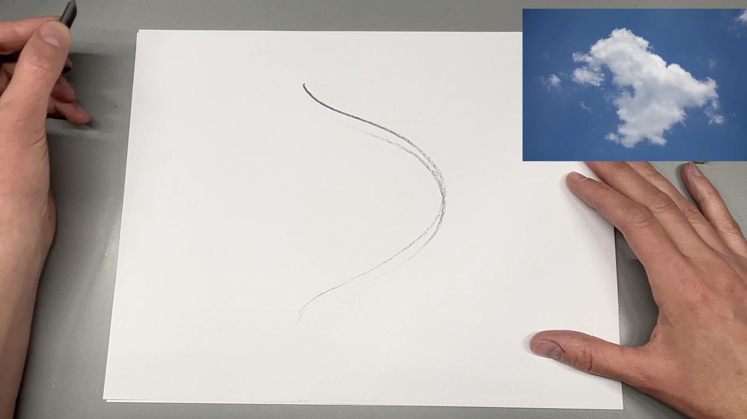
The Line of Action is the overall movement of the cloud. Think of an invisible line that gives it energy. This line captures the primary motion or tilt at the core.
I like to approach drawing clouds the same way I draw the human figure because both tend to move quickly. I start by observing the whole cloud and reducing its movement to a single line of action.
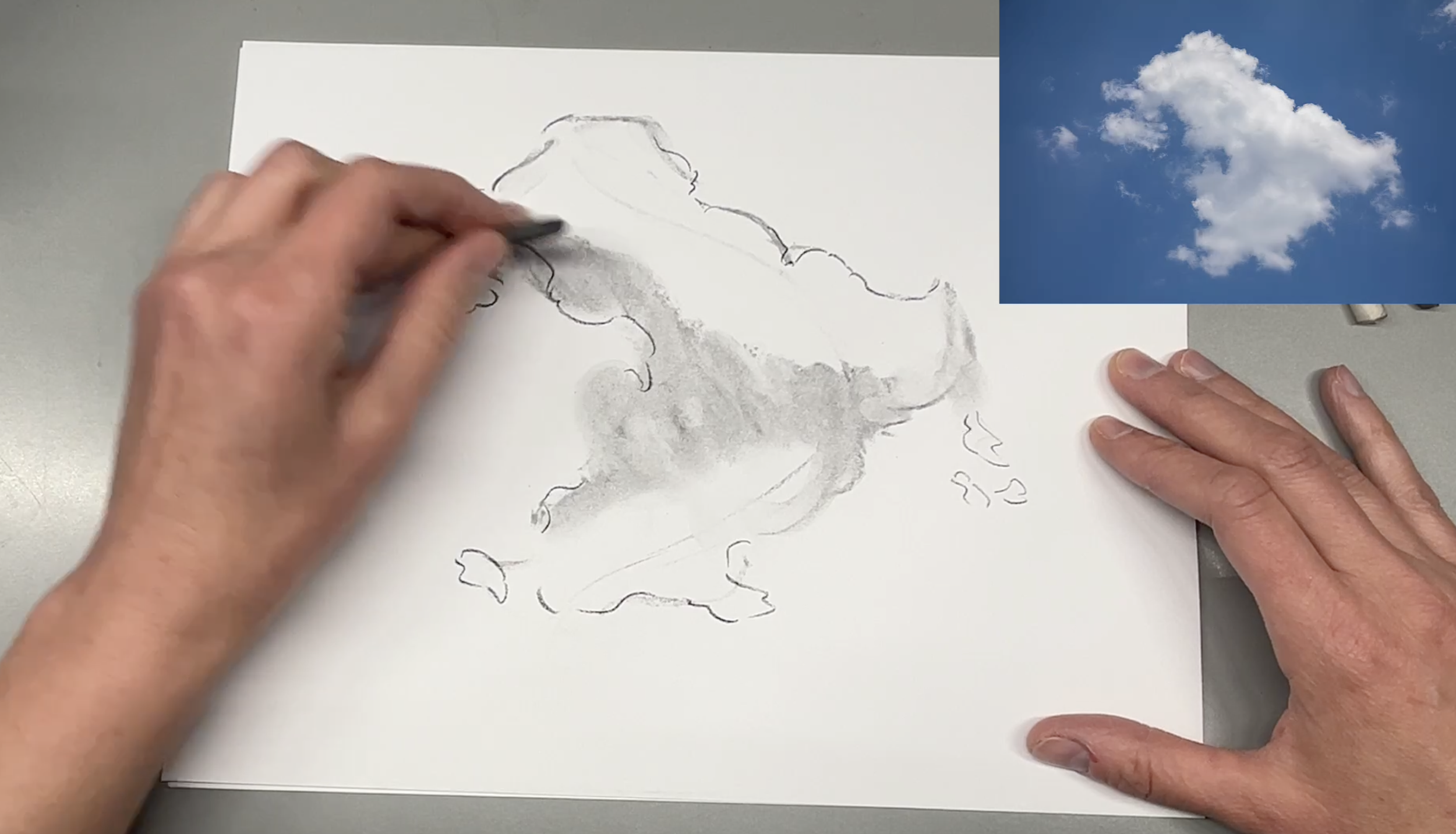
The Gesture is the simplified shape and dynamic feeling of the cloud. It’s about how it spreads, curls or floats generally.
I build upon the line of action by looking next for the gesture - the big basic shape - ignoring smaller shapes, contours and details. This helps me capture the form quickly. Once the overall gesture is established, I go back and add the smaller shapes, specific contours, details, and shading.
The approach makes sketching clouds from life fun and keeps them feeling lively and dynamic. It is best executed if you feel confident drawing long fluid lines instead of short choppy strokes. TO get better at creating long fluid lines, use your arm to draw, not just your hand or fingers. It also helps to hold the pencil or charcoal like I’m doing in the picture.
Tip 2 - Use Notan and Chiaroscuro to Define Value
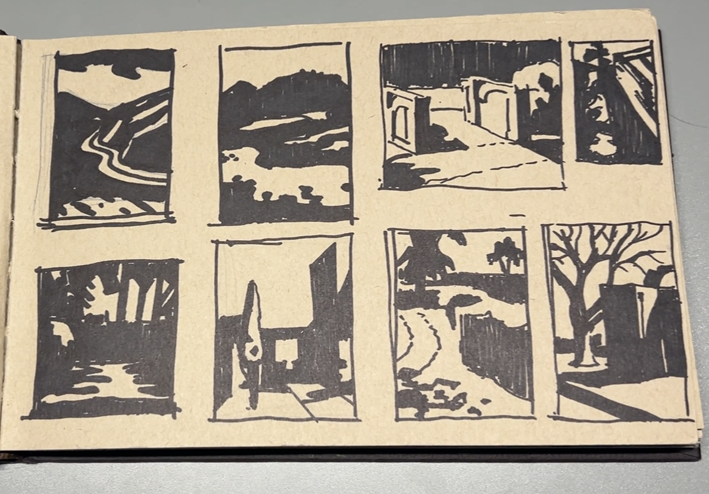
A page of notan studies in my sketchbook
When painting clouds, it’s easy to get lost in details or focus too much on color. Using the concepts of notan and chiaroscuro helps you step back and see the big picture.
Notan comes from a Japanese word meaning the balance of light and dark shapes. It uses only two values, as in my sketchbook example above. By assigning shapes to either light or dark, it allows you to simplify a scene into strong, readable forms. It is used primarily to distinguish light and dark local values.
Chiaroscuro is the Italian word for light (chiaro) and dark (scuro). It is used to define the light and shadow shapes that fall across a form.
These two ways of seeing can be used together, and often are depending on the lighting.

LEFT: Notan is used to find flat light and dark shapes in a composition.
RIGHT: Chiaroscuro is used to find the light and shadow shapes in a composition.
Below are two examples of how notan is used to see the light dark balance of clouds in a sky. As you look at these, ask yourself if the design feels balanced. If the design reads too heavily on the dark shapes, and let’s say you’re going for a light and cheery mood, you might consider eliminating some of the dark shapes to balance the design and “lighten” the mood.
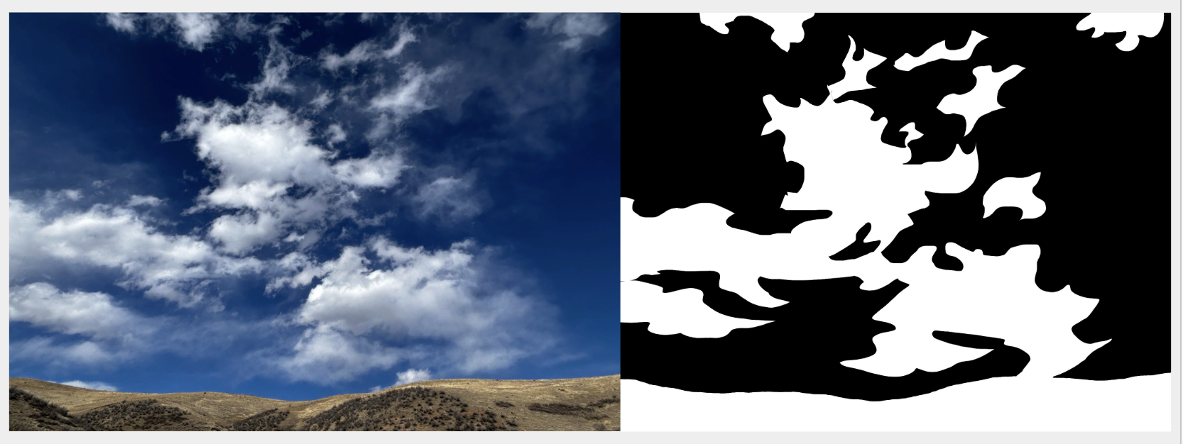
This notan study shows the abstract design of light clouds on a dark sky
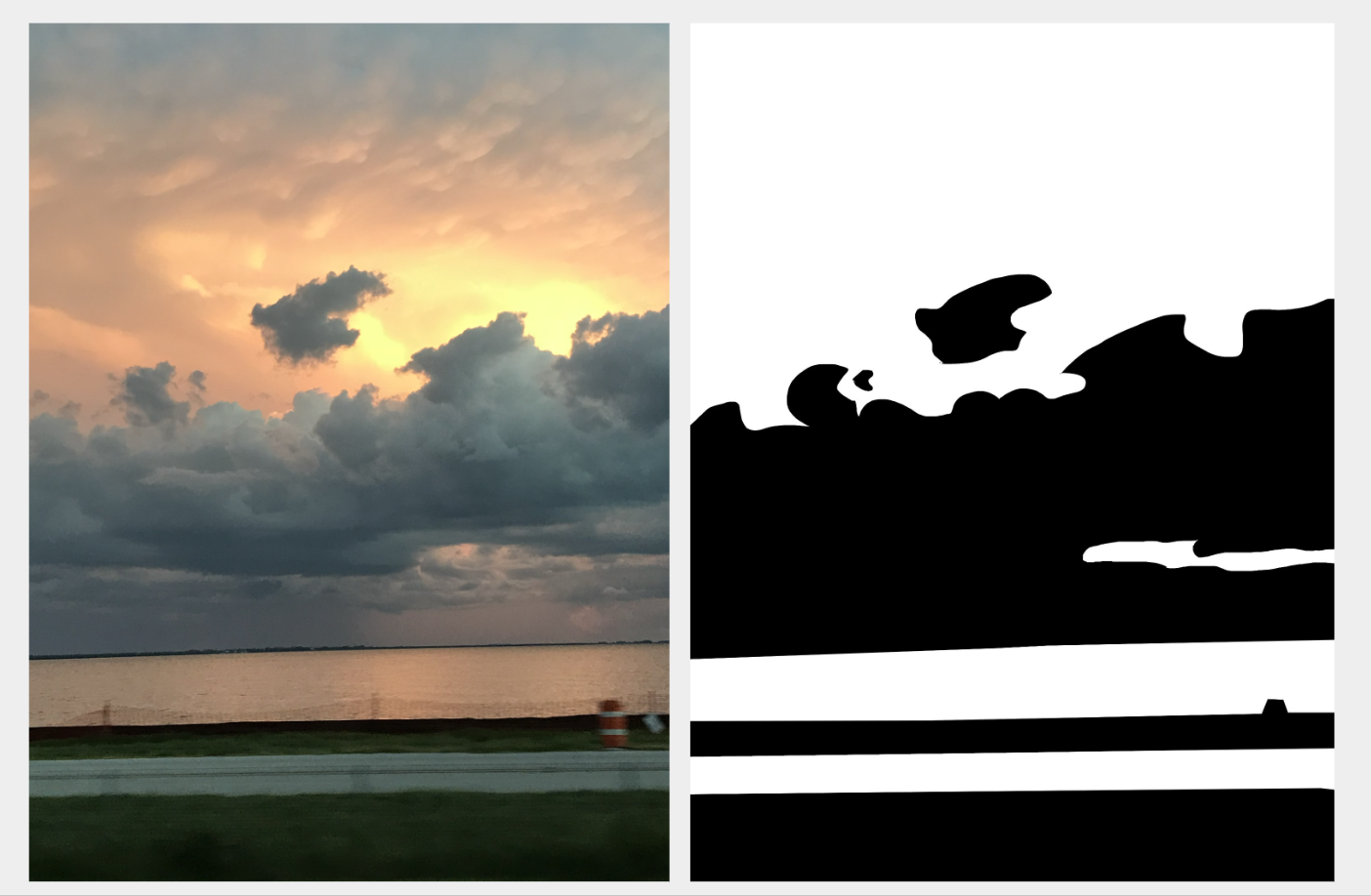
This notan study shows the abstract design of dark clouds on a light sky. Note that I decided to group the entire upper sky into the light shape. As a result, the upper portion of the notan design feels a little empty. I might consider adding a few dark shapes up there to see if it feels more balanced and help keep the eye lower on the focal point.
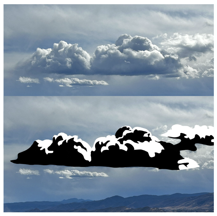
Below is an example of how chiaroscuro is used to find the light and shadow shapes. In this case, the cloud is catching light, giving a clear light and shadow design.
Tip 3 - Understand the Science of Light
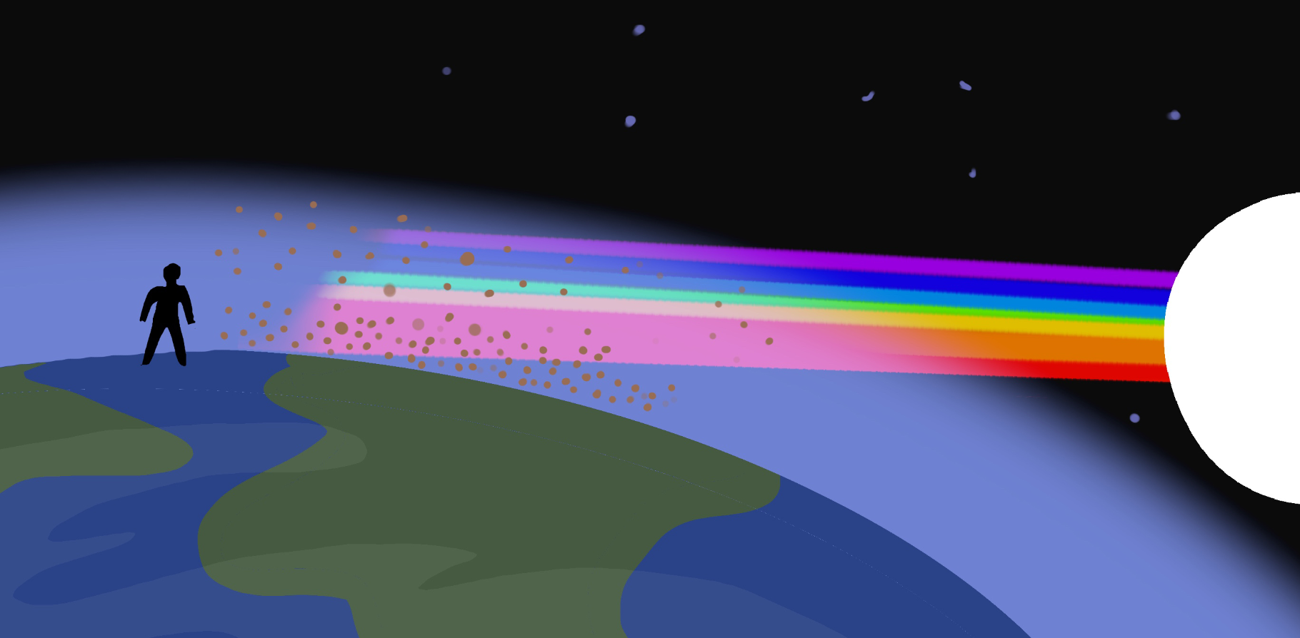
The sky is a dome of shifting gradients that changes color as the day passes. Understanding the basic science behind light and color, and how it affects clouds, helps demystify the hues we see and gives you the ability to invent color based on theory.
Clouds only exist because of earth’s atmosphere. Tiny particles suspended in the air scatter sunlight and create the colors we see in the sky. By observing how light interacts with these particles, you begin to recognize the patterns that occur throughout the day.
Sunrise
In the morning, sunlight travels through more of the atmosphere, which is often filled with moisture from the cooling of the earth overnight. The shorter blue and violet wavelengths scatter more easily, while the longer red, yellow, and orange wavelengths continue traveling through the atmosphere and its suspended droplets. This can produce gentle pinks, soft yellows, and subtle purples along with pale blues after the initial flare of sunrise over the horizon. Shadows often take on a violet hue and tend to appear soft and delicate during this time.
Afternoon
By the afternoon, the sun is positioned overhead and travels through less atmosphere. Clouds appear white during the afternoon because the sun is high in the sky and its light reaches the clouds more directly. Inside a cloud, millions of tiny water droplets scatter the sunlight in all directions. Because these droplets scatter all wavelengths of visible light fairly evenly, the combined light appears white to our eyes. Thicker parts of the cloud block some of this light, which creates the cooler gray shadows that give clouds their sense of form.
Even though noonday clouds look white and shadows look gray, you can use color theory to exaggerate a sense of temperature by adding a bit of yellow-orange to the light shapes and a bit of blue-violet to the shadows. The blue sky acts as a fill light, making cloud shadows look cool.
In the evening, the sun lowers toward the horizon and the light again passes through more of the atmosphere. However, by the end of the day, the atmosphere typically contains more particles like dust, ash, and pollution from the day’s activities. The light passes through, producing rich warm colors such as orange, gold, and red. The shadows can deepen into violets and blues, creating dramatic contrast.
Recognizing these patterns makes it much easier to paint believable clouds. Instead of guessing at color, you begin to understand why the sky looks the way it does and can apply that knowledge in your paintings.
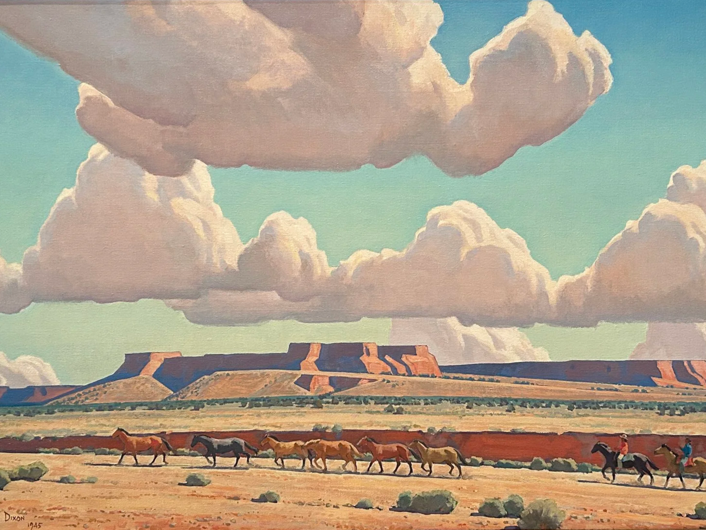
Tip 4 - The Three Edges
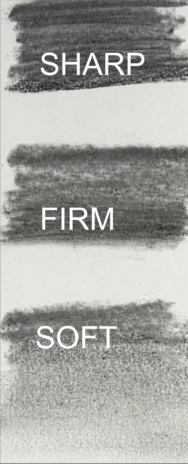
Edges play an important role in how we describe form in a painting. Whether you are working in oil, gouache, watercolor, or another medium, the way you handle edges affects how convincing and expressive your clouds appear. Edges exist on a continuum of three basic types: sharp, firm, and soft. By learning to vary your edges, you can make clouds feel more three dimensional while also shaping the overall style and mood of your painting.
Sharp edges can describe hard surfaces, abrupt plane changes, or high contrast due to direct light hitting a surface.
Firm edges have a smudge to them and give the illusion of things turning away from the viewer, things in the distance, or various textures, to name a few.
Soft edges can be a heavy smudge or a smooth gradient, suggesting soft textures, gradual plane changes.
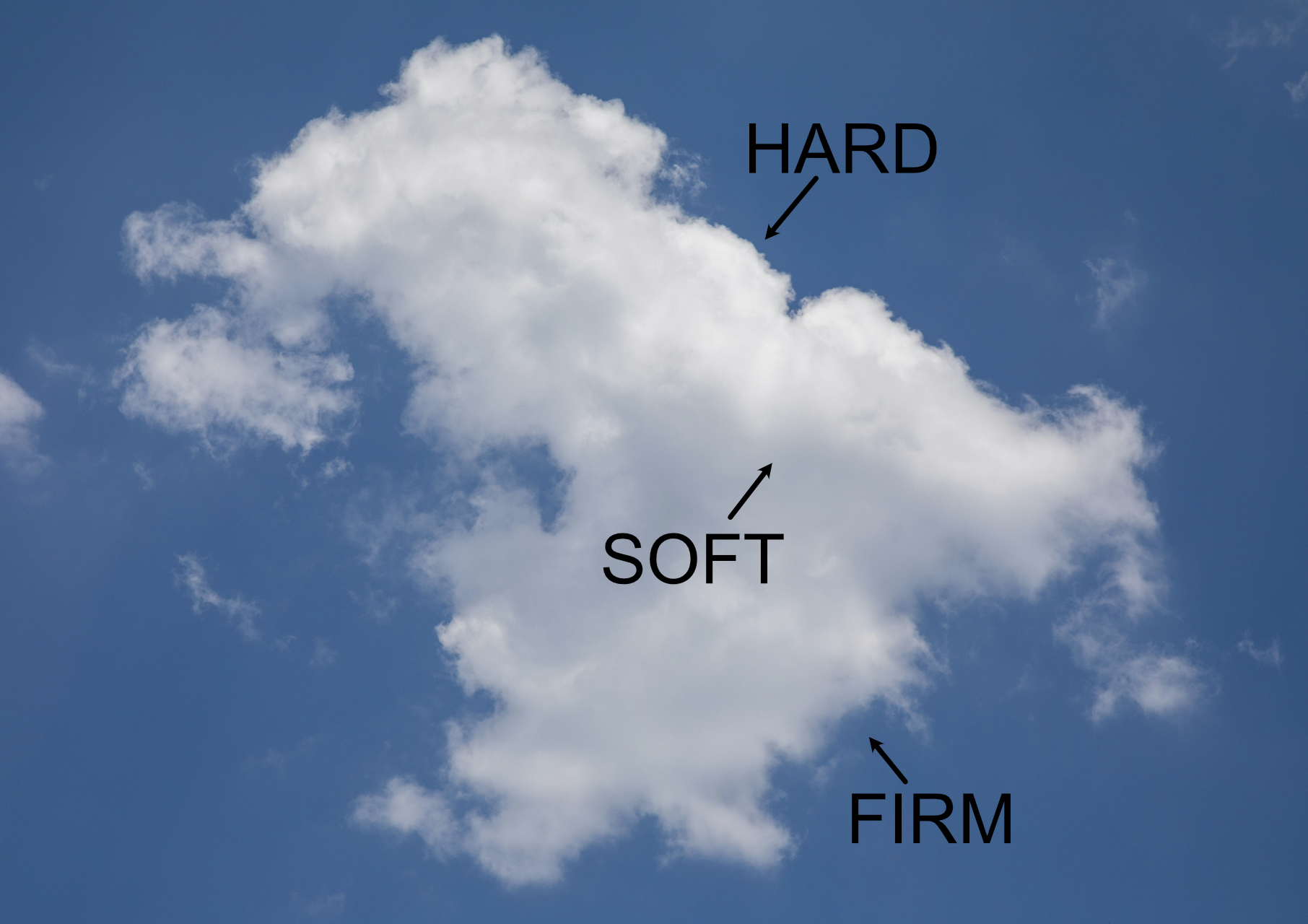
Where to find the three edges
The two paintings below employ all the edges, but lean more heavily towards soft and hard to create different moods.
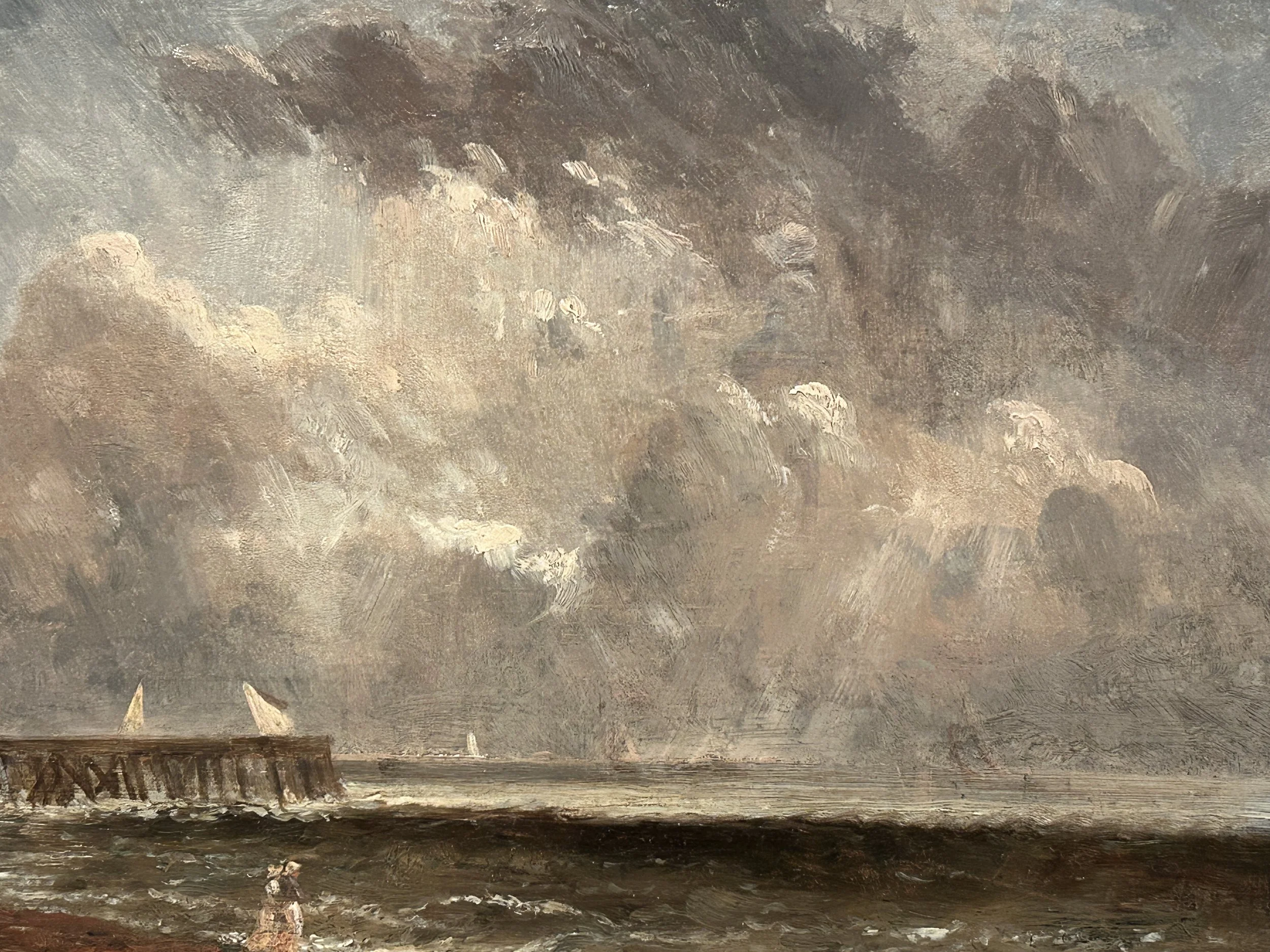
Tip 5 - Create Depth with Atmospheric Perspective
Atmospheric perspective is one of the most powerful tools for creating depth in a landscape, and it applies to the sky just as much as it does to mountains or trees. As objects move farther away, the atmosphere between you and the subject softens contrast and edges, cools color, and reduces saturation and detail. The same principles apply to clouds. Clouds that are closer to the viewer often appear warmer, brighter, and more defined, while clouds farther away become cooler, lighter, and softer in their edges.
You can see this effect beautifully in the skies of Albert Bierstadt. His cloud formations often have strong light and warmth in the foreground portions of the sky, while distant clouds recede into cooler tones and softer shapes. Just as warmer colors are often used in the foreground of a landscape painting, this idea can also apply to clouds. Subtle shifts in temperature, contrast, and edge quality help create a sense of space and make the sky feel expansive and believable.
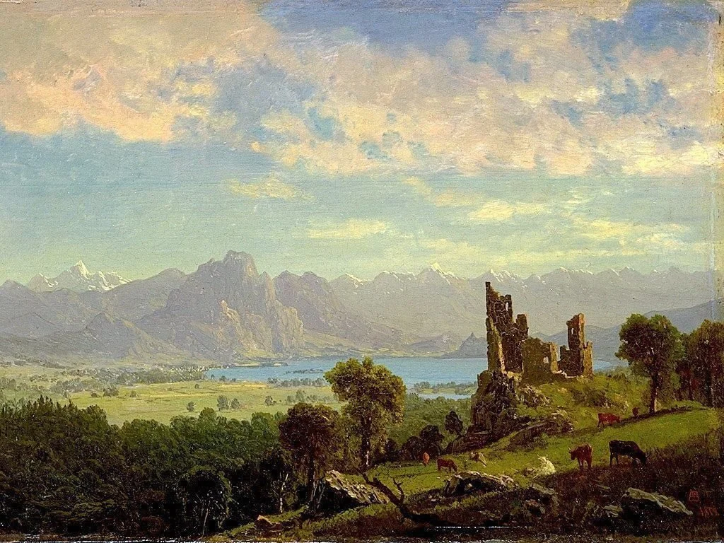
Albert Bierstadt | Scene in the Tyrol | 1854
Another way artists have used clouds to create depth is through the cast shadows they produce across the landscape. Many of the Dutch landscape painters of the seventeenth century carefully observed how clouds interrupt sunlight and create bands of light and shadow that move across the land. These alternating areas of illumination and shadow naturally lead the viewer’s eye deeper into the scene. A foreground may be brightly lit, while the next stretch of land falls into shadow from a passing cloud, followed again by a distant patch of light. This rhythm of light and dark helps push the landscape back in space and reinforces the sense of atmosphere and distance created by the sky above.
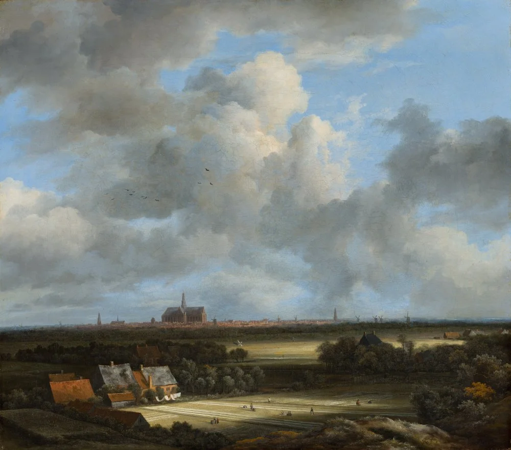
Jacob Van Ruisdael | View of Haarlem with Bleaching Grounds 2
Conclusion
Clouds are endlessly fascinating, and even after years of painting them, I am still learning new ways to see and capture their beauty. The tips I’ve shared here are the ones that have helped me most, but they are by no means the only approaches. I hope they inspire you to observe the sky more closely, experiment with your own techniques, and enjoy the process of translating clouds onto your canvas. Painting is as much about curiosity and play as it is about skill, and I’m excited to continue exploring these ideas alongside you. If you’d like to see these tips in action, I invite you to watch my full YouTube video: 5 Tips for Painting Better Clouds